|
|
 "QUANTUM SHOT" #635 "QUANTUM SHOT" #635
Link - article by Simon Rose and Avi Abrams
More Sea Monsters, Alternate Histories and - a Genuine "Road to Success" (Accept No Substitutes!)
I’ve always loved maps and had great fun researching and writing the first unusual and marvelous maps article last year. Here we take a look at some other cartographic curiosities from around the world, from the height of the Age of Discovery right up to the present day.
Keith Thompson created this caricature map of Europe on the eve of the First World War in 1914 for Scott Westerfeld’s 2009 graphic novel Leviathan:

(image credit: Keith Thompson)
When much of the world had yet to be mapped, many illustrations of the world’s still mysterious oceans featured the weird and wonderful creatures that supposedly lived there. This chart showing sea monsters dates from 1550:

(image credit: http://www.raremaps.com)
And here we see a sea monster off the North African coast near Sicily:

(image via)
On this 1570 map of Asia, we see a curiously shaped Japan and a Pacific Ocean inhabited by mermaids and strange sea creatures:

(image credit: University of Washington Special Collections)
Here’s another vintage map of South East Asia from the mid seventeenth century:


(image via)
This decorative map of the North Pole was created by the renowned cartographer Gerardus Mercator in 1623:

(image via)
Compare it to this map, detailing the competing territorial claims in the Arctic in the present day, as countries bordering the North Pole jockey for position as the ice steadily retreats:

(image via)
At the other end of the earth, this 1570 map shows the supposed great southern continent of Terra Australis Incognita. The map even shows land still imagined to be discovered in the far north:

(image via)
And have you ever wondered what Antarctica might look if it was free of ice? Here’s just one person’s opinion of how the great southern landmass might appear devoid of the ice sheet:

(image via)
On this fascinating language map of Europe, you can see just how closely, or not, national borders coincide with the language spoken by the local inhabitants - click here to see the full-size version.
In an earlier era, foreign governments often ruled a variety of different nationalities. Here we see the distribution of races in perhaps the most well known multi-national entity, the Habsburg Empire of Austria Hungary, in 1911:

(image via)
The German speaking peoples of Europe of course were all once part of the Holy Roman Empire, famously said to be neither holy, nor Roman, nor an Empire. Just look at the multitude of individual states shown here in Holy Roman Empire of 1789, on the eve of the French Revolution - click here to see the full version:

(image via)
And how about an empire straddling the three continents of Africa, Asia and Europe? Here we see the mighty Ottoman Empire under Suleiman the Magnificent, around 1580 - click here.
Appearing in my earlier article, Flags of Forgotten Countries, was Gran Colombia, the nation that comprised much of northern South America and parts of Central America, from 1819 to 1831. As the map shows, Gran Colombia included present-day Colombia, Ecuador, Panama and Venezuela, plus parts of Guyana, Peru and Brazil - click here to see the full version.
This fascinating and extremely colourful map shows the various states of the US flying the flags of countries with an equal population:

(image via)
Striking Comparisons
We sometimes forget that Australia is a continent. Here we see just exactly how sizeable the land down under is when compared to Western Europe:

(image via)
Here Australia is compared to a number of other countries, including the United States:

(image via)
This interesting map similarly reminds us just how large the continent of Africa really is, by superimposing some of the world’s largest countries:

(image via)
Africa also unfortunately figures prominently in this map showing the world distribution of doctors per inhabitants.

(image via)
Fanciful Figures Inside Maps
This curious map of Scotland, shown as a Scotsman, dates from 1869 (below left):

(images via 1, 2)
The earlier one of Ireland as Lady Hibernia from 1795 (above right) is by Robert Dighton, a well-known eighteenth century painter of portraits and caricatures.
This magnificently decorative map depicts The Netherlands and Belgium as a lion. At the time this was created, in 1617, the two counties were united as one nation, although the Spanish Empire ruled the area:

(image via)
The Victorian British cartographer Lillian Lancaster drew this map depicting the American election of 1880:

(image via)
This Adidas map of Europe is a bit more up to date, commemorating the Euro 2008 Soccer championship.

(image via)
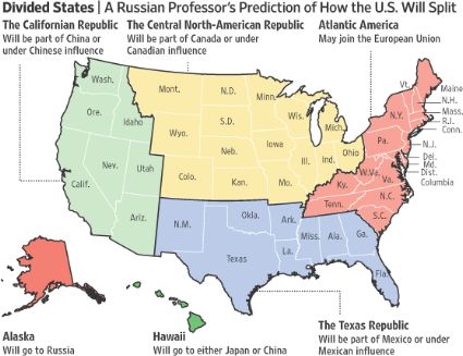
The alternate history genre has produced its fair share of fanciful maps in the past and no doubt will continue to do so. Here’s an alternative map of the USA, based on a Russian professor’s prediction of just how the USA will one day splinter into several pieces:

(image via)
The Allegorical Map for the "Road to Success"
This is the Victorian Road to Success which is still relevant to our day; if you follow the good advice contained in this graphic depiction of the Grand Way to Glory, you'll be well ahead everybody (who might get stuck, for example in the Beer Gardens of Bohemianism, or take indefinite vacation in a "Know-It-All Hotel") -

(image via 1 and 2)
Click here to enlarge for details... gotta love this "Hot Air" air balloon...
I hope you’ve enjoyed our journey through the curiosities of cartography. Until next time...
Article by Simon Rose and Avi Abrams, Dark Roasted Blend.
CONTINUE TO PART THREE! ->
READ THE FIRST PART HERE ->
|
|
RECENT ARTICLES:
"Dark Roasted Blend" - All Kinds of Weird and Wonderful Things, Discovered Daily!"
DRB is a top-ranked and respected source for the best in art, travel and fascinating technology, with a highly eclectic presentation. Our in-depth articles in many categories make DRB a valued online magazine, bringing you quality info and entertainment every time you visit the site - About DRB
Connect with us and become part of DRB on Facebook and Twitter.
YOUR COMMENTS::
READ OTHER RECENT ARTICLES:
CATEGORIES:
Feel-Good! | airplanes | animals | architecture | art | auto | boats | books | cool ads | famous | futurism | food
gadgets | health | japan | internet | link latte | military | music | nature | photo | russia | steampunk
sci-fi & fantasy | signs | space | technology | trains | travel | vintage | weird | abandoned
|
|


13 Comments:
Thanks for sharing a nice blog.I really like your post. The picture you have posted here is really very nice. Great post!
Hello - Thank you for featuring one of our maps in your article. We appreciate the publicity.
Could you please credit "University of Washington Special Collections" for the 1570 Asia map and link to it at:
http://content.lib.washington.edu/mapsweb/images/Viewer/G7400_1570_O67.html
Thanks again,
Angela Rosette-Tavares
Digital Initiatives Program
University of Washington Libraries
Thank you Angela, the info is added
Your ...
"Africa also unfortunately figures prominently in this map showing the world distribution of doctors per inhabitants."
... entry should be titled:
"Africa also unfortunately figures prominently in this map showing the world distribution of inhabitants per doctors."
WOW! really great list. Thanks for sharing.
Found this website full of maps chartsbin.com
The Leviathan map by far outshines the rest of the maps. It's just so fantastic. It's the reason I spent $20+ on the book.
Very Nice! Thanks for sharing the maps.
soberncrazy
Very cool maps!
Notice how Russia has the greatest number of doctors per capita. Trouble is, some of those doctors are not as good as those, let's say, in the U.S. So the numbers aren't everything!
Cool stuff, such imaginative maps, awesomeness.
Something similar to that Russian professor's split-USA map appeared in a recent Clive Cussler novel as a possible prediction.
Also, since when is the Palestinian Authority a country?
This is the most amazing post I've read this summer. What a fascinating collection you've got here. Certainly provides more than enough inspiration for a writer.
Thanks!
Miranda
Just poking around and found your site... noted that this site:
http://www.barron.co.uk/Lilian+Lancaster
gives credit for the Scottish caricature map to Lilian Lancaster.
I wish I had copies of all these lovely maps! Really nice blog. THanks for sharing.
Post a Comment
<< Home